In my previous article, I discussed how changing from Photoshop to Sketch for digital design made sense for us as an agency, and how we’ve benefitted from the switch. For all its triumphs however, Sketch does present some workflow differences that might deter longtime users of Photoshop for web and digital design. In this article, I’d like to highlight those differences, how we dealt with them - and ultimately welcomed the change.
Handovers without source files
An initial hurdle for us to overcome after switching from Photoshop to Sketch was design handovers. This is the process of giving client-approved designs to a development team to program into functioning webpages.

Traditionally we provided developers with the associated Photoshop Document (PSD), they would open the project file, and extract the assets they needed - like images, icons, typeface names and colour codes. Once we ditched Photoshop, we were suddenly without PSD files to hand over - as Sketch only runs on Mac, and our development teams use Windows and Linux. The solution was to start creating ‘design specs’ – something we wanted to be doing already - but were now forced to by the absence of an actual source file to hand over.
What are design specification documents?
Similarly to how functional spec documents outline technical functionality and restrictions of a project – design specs are now our point of reference for any designs going into production. These documents are deliverables that go to our development teams.
How to create design specifications

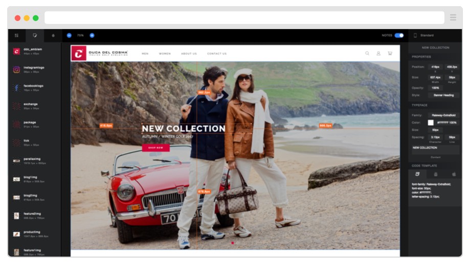
One Sketch plugin that handles design specs easily and elegantly is SketchMeasure by utom. It creates an offline, HTML version of your mockup with which developers can inspect and extract measurements and assets, see elements’ sizes and positioning - plus copy out working CSS code - all from their browser. The plugin is free, regularly updated, and was (mostly) welcomed by our development teams, as it eliminated their dependence on Photoshop files.
Cloud-based design handoffs

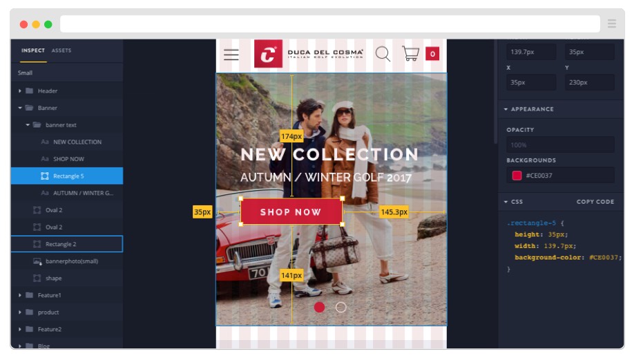
Recently however, we’ve been using InVision’s ‘Inspect’ feature to share designs. After designers’ project files are uploaded and synced using Craft Sync (a Sketch plugin by InVision), developers are able to inspect them, with access to assets, sizes, fonts, images as well as grid positioning and CSS code.
‘Synced’ design files are a major advantage of cloud-based handoffs, as it saves time having to re-export designs that inevitably change. When a designer is happy with their changes to a project, they can ‘sync’ it with the online version, keeping everyone in the loop. The latest design is always visible to all team members - from anywhere. We also looked at Avocode and Zeplin for design handoffs, each of which work in similar ways.
Designers in control of assets
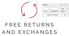
 Another workflow difference that we’ve found to be an improvement is how assets or ‘slices’ are prepared. Within Sketch, icons and images that need exporting as separate files are flagged by the designer before the handover happens.
Designers declare the filename and format (JPG, PNG, SVG etc ), and Sketch creates asset files automatically on export or sync. This keeps the designer in control of what assets go out, and saves developers time having to extract these elements themselves.
Prototypes are the new mockups
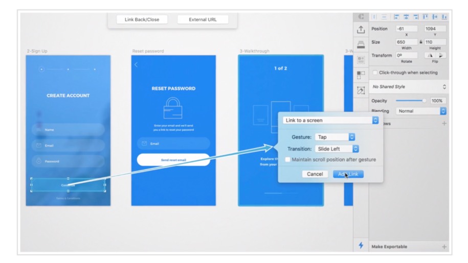
Another nifty new addition to InVision’s ‘Craft’ plugin is Prototype. This gives designers the ability to link certain screens together with specified click points, essentially prototyping from within the design suite. The project is then uploaded as a clickable, interactive prototype. This is useful for early concept testing and client presentations. Adobe’s latest UX/UI software Adobe XD offers this a native functionality.

In conclusion
Change can be daunting and disruptive for those used to certain ways of working, but we have definitely benefited from embracing these new tools and workflows. We often even find ourselves wondering how we did things before!